10 Easy Steps to Make Your Website Accessible to Everyone
By Anna Sutherland · 13 May 2024 · 17 min read
*If you've created or are planning to create a website to showcase your research, it's important that ANY viewer should be able to access and understand the information in it, including anybody with a visual, neurological, cognitive, auditory or motor impairment. So, I've laid out some quick and effective techniques that you can use to transform your website into an smooth and simple browsing experience for any viewer. *
This might sound like a lot of work for little gain, but making your website accessible will improve the experience for ALL of your viewers. A website that's awkward to navigate, difficult to read, or that doesn't clearly signpost links and important information is going to put your viewers off, and at the end of the day the more people who can easily access your research findings, the wider and more far-reaching your impact will be.
The topics I've included will cover how you can make your text legible and easy for any viewer to interact with, how to make your imagery accessible to people with sight issues, how to make your website easier to navigate, and how to make any learning material with audio accessible to people who are deaf or hard of hearing.
Before I start, one thing to keep in mind is that any changes you are able to make to your website will depend on the platform you've used to create it. You've probably used an online website builder such as WIX, SquareSpace, Site123, etc, and most of the techniques I've included are based on that assumption (although many of them can be adapted to a website creating by coding, if you've chosen that option). Depending on which website builder you've used (or are planning to use) the more basic techniques I describe should all be possible, but some of the more advanced techniques might not (although your platform might update it's available features in the future).
💡 If you haven't chosen a platform yet, here is a list of popular online website builders for personal academic websites.
Text
The visual appearance of your text is essential to making your information accessible to viewers; if you're text is difficult to read you'll loose your viewer before your content has a chance to catch their interest. There are several features of your text that you can use to ensure it's accessibility.
1. Choose the Right Fonts
You will have two main types of text in your website: main text, which is usually made up of blocks of paragraphs where the bulk of your information will be displayed, and decorative text, for your headings, subheadings, etc.
Your choice of font is important so that people can read your text easily. For the main text (also known as 'body text') choose something very simple with slim strokes that's easy to read in large blocks. It'll depend on which fonts are available on your website builder, but they'll have several body texts available to choose from.
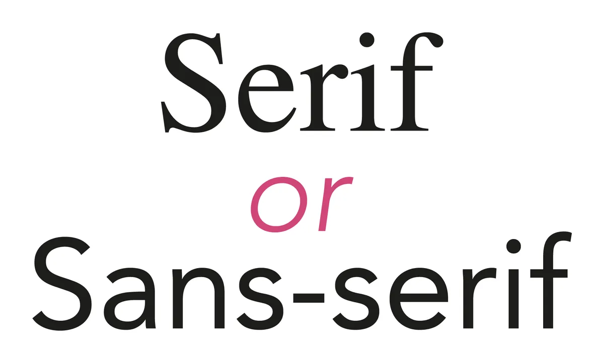
Two of the most basic categories of font are 'Serif' and ‘Sans-serif’. Serif text has decorative tails and flourishes and the width of their lines vary, whereas sans-serif fonts are simpler, have no decorative features, and clean lines that are always the same width.
Whether you use serif or sans-serif fonts depends on the overall style of your website, but to make your main body of text as legible as possible, choose a font that's easy on the eyes in large blocks.
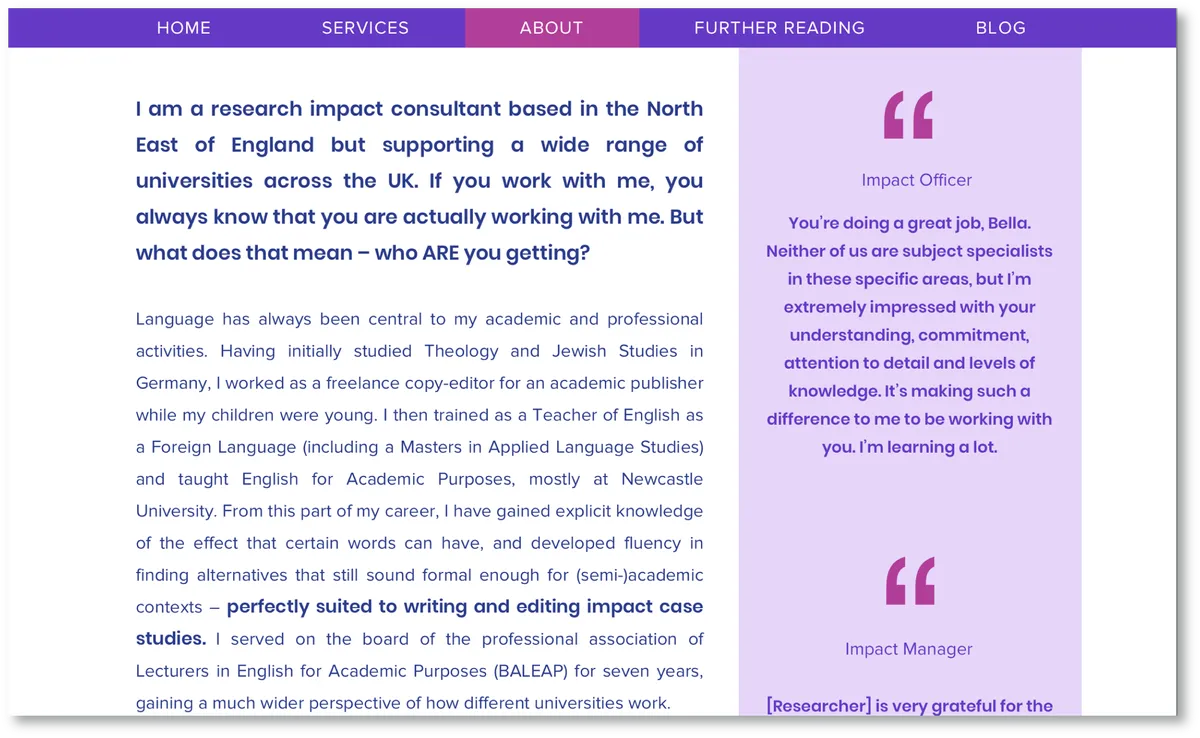
Here's an example for a website I designed for Bella Reichard that uses a san-serif font throughout the design, for the menu, headings, main text, etc.
On the other hand, serif fonts are classier and more traditional than Sans-serif fonts and they can also be a good choice for your body font, as long as you choose one that's still easy to read in large blocks.
Here's an example from The Guardian newspaper's website:
Also, depending on the platform you’re creating your website on, you may have the option to use the same font in different weights, e.g. 'Light', ,Regular', 'Bold'**. It’s best to use a lighter **font for body text as it’s easier on the eye in large blocks, but you can use a thicker font to highlight important text, or for your headings. Light-weight fonts work for headings too, though with very light-weight fonts it’s especially important that the colour stands out so the text doesn't disappear into the background.
2. Pick Contrasting Colours
Contrast is important for text's legibility. If your text doesn't contrast from it's background enough it will be difficult to read, and you'll loose your viewer's interest.
The most obvious choice for your font colour is
black text on a white background,
which has a high a contrast as you can get and is very easy to read. However, if you want to make the appearance of your website more unique/interesting you can use coloured text, and/or a coloured background.
Choose a font colour that contrasts well with its' background. The standard choice is dark text on a white background, but you could also go with light text on a coloured background (which is also known as the 'reverse' effect). You can use this effect to make sections of your website more eye-catching, like forms, buttons, or certain blocks of text that you especially want to stand out, like headings or an introductory paragraph.
You can use any colour combination you want! For accessibility, all that matters is that it contrasts enough from it’s background to be clearly legible. For example,
This is easy to read for most people,
whereas this is harder to read,
and this is almost impossible.
💡 If you're in doubt, here's a handy tool for checking the colour contrast between your text and it's background.
3. Use Descriptive Linked Text
It’s important that your links are clearly identifiable. Linked text needs to look different from the rest of the text in at least one way. The most common method is to underline it, or you can make it a different colour, or you can do both.
💡 This also applies to buttons. They should also have a eye-catching design so they're easy to identify.
However, people who have a visual impairment will most likely be using a screen reader to access your content. A screen reader is a technology which goes through the text on your site and reads it out loud, and some of them can even be used with a Braille display. Linked text needs to clearly signpost where it’s linking to to be accessible to these viewers.
*“Screen reader users often interact with the page by tabbing through headers and links. If the entire page is a wall of “learn more” links, then it becomes tedious to find which link relates to what.” *
Often, linked text will just say something like ‘Read more’, or ‘Click here’, but this won’t necessarily work for everyone. To solve this, your linked text needs to clearly describe the link’s destination. For example, instead of:
“Learn more about making links noticeable here."
your text should say:
“Learn more about making links noticeable."
Here's an example from our own website where we got rid of a lot of buttons that all said 'Read here', and replaced them with descriptive linked text:
This mades several of our webpages easier to interact with for people using screen readers.
4. Establish Text Hierarchy
You might not have heard of text hierarchy before, but it can make life so much easier for visitors to your website who have a visual impairment and are using devices with screen readers to access your content.
Even if the headings , sub-headings, etc on your webpages are easily identifiable to most people because they're in a larger/decorative font and/or a different colour, this is no use to someone who can't see them. If you have the option available, you should label your text so that a screen reader can identify headings, sub-headings, and paragraphs, etc, making it easier for users to navigate through the site.
Whether you can label your text and the method you use to do it will depend on your website builder platform, but I've included an example below of how to do it in WIX as it's the platform we use at Fast Track Impact:
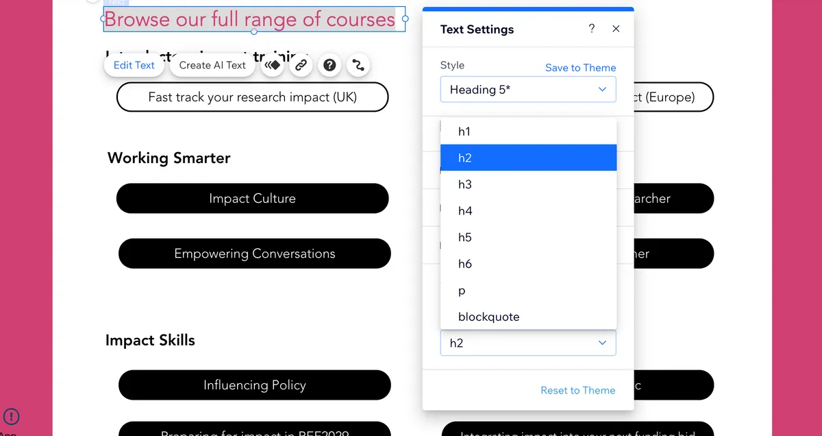
- Select the text you want to label
- Click 'Edit text'
- Click 'SEO and Accessibility'
- Select the label you want from the drop down menu - Use 'h1' for the main title of your page, and then continue in chronological order, i.e. 'h2' for headings, 'h3' for sub-headings, etc, and use 'p' for body text.
It wont matter what order your labels appear in. For example, your page title might appear after a paragraph for whatever reason, or there will be a paragraph between a heading and a sub-heading (like in this blog post). All that matters is that the screen-reader can identify the text's label and communicate it to your site visitor.
💡 If you've created your website with html code the text will automatically be labelled. Headings, sub-headings, paragraphs etc are created using tags such as h1, h2, p, (heading 1, heading 2, paragraph), etc , and as long as they're tagged logically (like with the WIX example above), the screen reader will identify them and use them to navigate through the webpage.
Imagery
Imagery has always been a powerful tool in conveying messages and ideas, and it doesn't have to be inaccessible to people with sight issues.
5. Use Imagery to Enrich the Experience
Accessibility doesn't just mean "the quality to be easily used and understood", it also means "the quality to be appreciated". Using imagery when you can will be huge boost to your website; it adds visual interest, it can be used to break up large sections of text, and sometimes it can communicate your message far more effectively than text. These images can include photos, graphics, figures, infographics, etc.
With an image you can convey so much information, and that same information can be conveyed so much more quickly than in words.
To put it bluntly, the more visually interesting your website is, the more likely it is that people will want to view it (and take in the information you're giving them).
You may also be able to edit images in your online website builder so that they are interactive, although as I've said it depends on the website builder you're using, e.g:
- Clicking them makes them open in a pop-up so you can view them more closely (this would be useful for people who struggle to view small small images)
- You can add a link to an image, like you would with text or buttons. You could use this to link to another page in your website, or to the source of the image (if it's relevant to your content), or to whatever weblink you choose.
- If you want to provide an image/s as a resource, you could make it downloadable.
💡 Here's a tutorial on how to add links to images in code
6. Set Up Alt Text
If it’s possible in whatever platform you’re using to create your website, add alt text (Alternative Text) to images. Alt text describes the content of an image and can be read by screen readers which will read the text aloud for people with visual impairments. In many websites, you'll see this text in a pop-up box if you hover over an image. Alt text will also be displayed instead of your image if the image itself fails to display for any reason. This text should be both detailed and short and straightforward so that it will fit into the space that your images would have taken up.

For example, most people will look at this photo (above) and just think “Cat"; but for somebody who is blind or has a visual impairment and is relying on the description from their screen reader, or if the picture hasn't loaded and the viewer is only seeing the alt text, that’s a very vague description. They might hear the word ‘cat’ and picture this:

Or this:

Or this:

To avoid this issue, your description needs to give the reader a lot more detail, e.g. “An adult white cat with ginger markings sitting on a table” That description gives the reader the essential information; it doesn’t include every detail, but it includes enough for the person to envision what’s in the photo.
*“**If you can close your eyes, have someone read the alt text to you, and imagine a reasonably accurate version of the image, you're on the right track.” *
It’s the same with diagrams or charts which contain essential information that isn’t necessarily included in your main text. It’s still important to keep it short and straight-forward, while still providing the reader with the essential information, and there's a formula you can follow to make this process easier:
Diagram type* of type of data *reason for including diagram,
and include a link to the data source (the information/statistics used to create the chart, whether it's online or from a physical publication like a book or a magazine) somewhere in the text
For example:
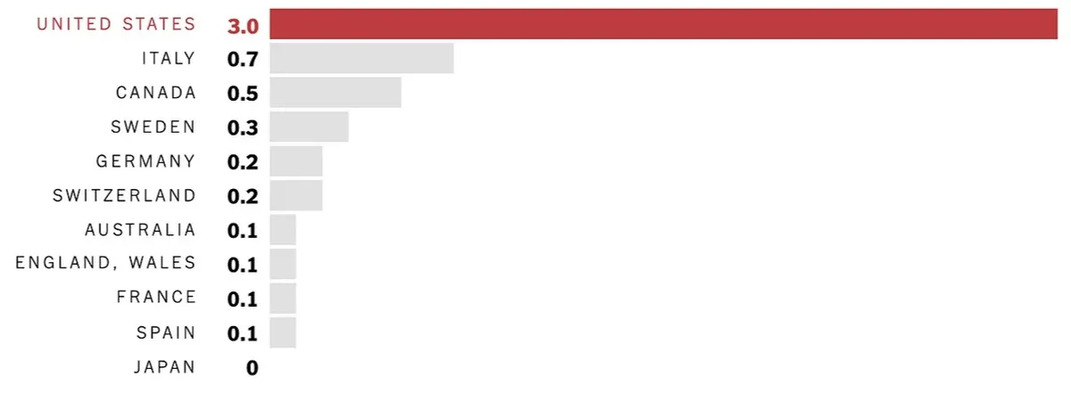
**Alt text: **Bar chart of gun murders per 100,00 people which shows that America's murder rate is 6 times worse than Canada, and 30 times Australia
And in your main body of text include a link/signpost to the data source, e.g.
"In a recent study conducted by..."
or
"After reviewing data from ..."
💡 Find out more about alt text for data visualisation here
The way you add alt text to your images will depend on which platform you're using to create your website. If it's an online website builder you'll probably be able to find the method in their 'Help' section, or just look it up in your search your search engine, i.e. 'how do I add alt text to an image in WIX/Squarespace/etc'.
💡 If you've created or had the website created using code, here's a link to a tutorial on adding alt text to images in your html.
Navigation
Making a website easy to navigate will make the viewing experience better for all of your viewers, so it's a good practise to get into. If browsing through your website is a smooth experience, you'll hold people's attention for longer.
7. Organise your site menu
It's important that your site menu doesn't display too much or too little at first sight. Too much and it'll be overwhelming, and visitors to your site might be put off. Too little and it's confusing, as people won't know where to find the information they're looking for.
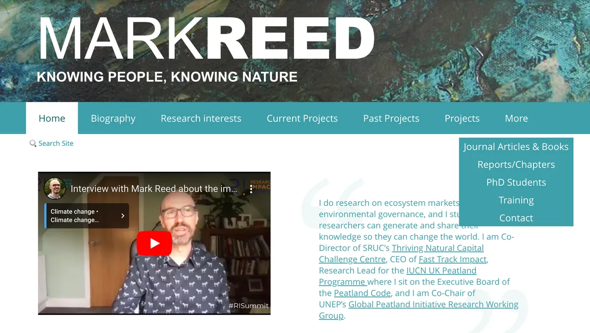
First, make a list of all of the pages in your website. For example, here's a list of the individual pages in Mark Reed's personal website:
Home
Biography
Research Interests
Journal Articles and Books
Reports/Chapters
Current Projects
Past Projects
PhD Students
Training
Contact
Altogether that's individual 10 pages, which makes the menu very crowded. On most online website builders you'll only be able to create a certain number of pages before there are too many to fit into the available space, and the 'extra' pages will automatically be put under a 'More' tab, which can make your menu look badly organised - like you haven't really thought about it's usability.
You can solve this easily by sorting through the pages and finding the ones which can be grouped under a collective heading:
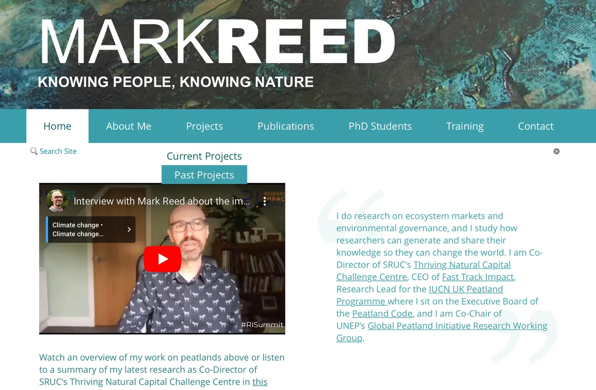
Home
About me
-Biography
-Research Interests
Publications
-Journal Articles and Books
-Reports/Chapters
Projects
-Current Projects
-Past Projects
PhD students
Training
Contact
That cuts Mark's main menu down from ten to seven items, which makes it look much more organised and removes the need for a 'More' tab. Most online website builders will have the option to group menu items into sub-menus, and it's a good practise whether your menu is very full or not. The key is to name your collective headings logically; e.g. 'Presentations', 'Videos' and 'Podcast' could be sorted under 'Learning Materials', or if you create individual pages for different research projects you can just group all of them under 'Research Projects'.
Also, many website builders give you the option to hide individual pages from the menu altogether, which can be useful if a new page isn't ready yet, or you only want viewers to find it after going through a certain process e.g., you've created a quiz and you want to signpost them to a separate page with the answers after they've completed it.
💡 Many websites don't include the homepage in the menu, and instead you can navigate to it by clicking the logo/website name in the header. Just select the logo/name, and add the link to the homepage it's settings.
8. Design your site menu
The way your site menu looks is important as well. I've already spoken about how choosing the right font and colour can improve the appearance of your site, and building on that you can design the menu so that it's both attractive and easy to use. You can do this in a number of ways:
Make it eye-catching: try making the design of the menu stand out from the rest of the site, so users see it straight away. For example, if most of the content on your site is dark text on a light background than make the menu light text on a dark background. You could use a different/more decorative typeface for the menu, but remember to choose one that's still easy to read (see the section about choosing the right font, above).
Space it out: Don't crowd your menu items together, as someone who struggles to use a mouse/track pad might find it tricky to click on the item they want without overshooting and clicking the one next to it.
Signpost sub-menus: If possible, include an icon next to a sub-menu heading to indicate that there are additional options, e.g. a down-arrow. This is another feature that may or may not be available in your online website builder.
**Clearly indicate active pages: **In most site menus the design of a heading will change when you hover over or select it, e.g. the font colour/the background colour/the text is underlined/etc. It's up to you what you choose, but the more obvious the difference is the easier it is for your viewer to be sure that they're selecting the menu item they want.
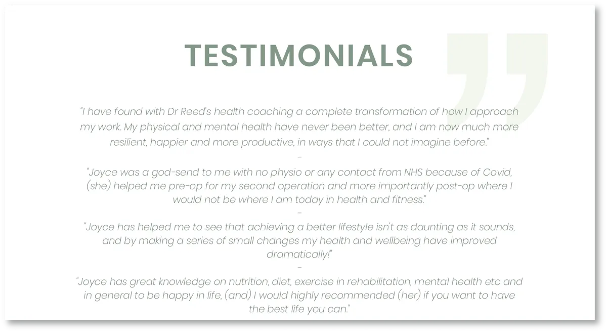
Below is an example from a health coaching website I designed for Dr Joyce Reed, who also runs two health and wellbeing courses for Fast Track Impact that are geared towards academics:
The Health Resilient Researcher
The Resilient Researcher Coaching programme
I recently updated the site to make it more accessible. Previously, when you hovered over a menu item the text just turned slightly lighter, which was too subtle a change to really be accessible. I updated the design, so now the design switches from dark text on a light background to light text on dark on hover, which makes it contrast strongly from the rest of the menu.
💡This is also a good technique to use with buttons/interactive icons/etc on your website. When viewers hover over them, make sure their appearance changes noticeably. Also, create some empty space around them to make them easy to select.
**Keep it consistent: **If all of your interactive items like menu tabs and buttons, etc, react in the same/a similar way e.g. the text always changes from black to blue or becomes underlined when you hover over it, then users will learn how to navigate your site quickly and become more comfortable with browsing it.
9. Create a Mobile Version
Nowadays most people use their smartphones as well as laptops/computers to view websites, but as a normal 'desktop view' of your website's pages will be too small on a phone screen it's important to have a mobile view of your website that will automatically be displayed on a smartphone.
If you have a smartphone you'll have seen a lot of mobile views of websites, but here's a basic rundown on how they differ from desktop view:
- The layout will be adjusted so that items that appear next to each other in desktop-view will instead be stacked on top of each other in mobile view to make them less compressed
- Images will be larger so they don't disappear into the background
- The menu wont fit in the screen, so instead there's a menu icon you can tap to access the full menu.
- The pages may have a floating 'Back to top' button, to save a lot of scrolling. This makes accessing the menu quicker.
Most online website builders include the ability to make 'mobile-friendly' version of your website that viewers will see on their smart phones, and they'll automatically re-organise your website's elements into a mobile-friendly layout. This can save you a lot of time, although you may need to rearrange things slightly afterwards as the editor might put one item on top of another that actually needs to go underneath, or the spacing between items might be awkward.
Here are some tips to make your mobile-view more accessible:
**Space it out: **mobile view relies on touch-screen navigation, so create space between interactive elements. This will help people with fine motor difficulties tap/swipe the item they want.
**Make interactive elements larger: **this also helps people with fine motor difficulties interact with your site more easily.
**Increase the font size (if you have to): **the font size in mobile view needs to be as legible as it is in desktop.
Check relative 'directions': you may have an image/graph/figure on your site that you reference in your main text, e.g. 'See below'/'On the right...', but that item may be in a different relative position in mobile view. Instead, try giving it a caption and referring to it by that, e.g. 'See Figure 2'.
**Break up the text: **scrolling through a large block of text can get boring after a while, and viewers can lose interest and skip ahead, so they might miss something important. Try and break up your text with imagery/quotes/videos/any other interesting feature.
'Freeze' the menu: Another possible technique (again, this depends on the platform you use) is making the menu icon's relative position on the screen 'frozen'. This means that rather than disappearing when you scroll down, it's always visible - floating at the side of the screen. This is a useful technique if you have a lot of content on your pages, so that viewers can access the menu quickly rather than scrolling all the way back up to the top.
Go the extra mile
If you've got the time and patience, there's one more technique you can use to help make the material on your site accessible.
10. Transcribe Videos and Podcasts
You probably read that and groaned, and I don't blame you! Of all of the techniques I've described, this one is definitely the most time-consuming one. But if you create a podcast, a video, or any presentation that includes audio to present your research findings, but you don't have those findings recorded in any written format, then people who are deaf or hard of hearing can't access it.
Over 5% of the world's population (430 million people) suffer from 'disabling' hearing loss according to the World Health Organisation
Transcribing your work doesn't necessarily mean listening to your own videos/podcasts and writing down the dialogue word for word, there are ways that you can make the process quicker and easier.
- If you can, record in a quiet room, so whether it's a person or software transcribing it for you the audio will be clearer and easier to understand.
- If you're going to add intro music or sound effects to your final production, keep a copy of the unedited audio for transcribing.
- If you've written a script to create your audio, whether it's word-for-word or a collection of prompt cards, use it to create a transcript.
- If you don't already have a written version, there are several kinds of software that will transcribe an audio file for you. These softwares can have their issues, e.g. they can 'mishear' your audio and make mistakes that you have to correct, or they are more accurate but also more expensive to use, but they will make the process of transcribing much quicker. Here is a list of transcription softwares.
- Create a Google or Word document and open the 'Dictate' tool, then replay the audio over headphones and repeat what you hear, letting the dictate tool transcribe it for you. This is more reliable than using your original audio to create the transcription as there may be background noises or music that interferes. Also, when we talk normally there's inevitably a lot of 'Umming' and 'Ahhing' and repeated words that will be picked up as well.
- If you really feel that having transcriptions of your audio will benefit your research impact, but you just don't have the time to spare, have somebody else transcribe it for you.
Once you have your transcription, provide a typed copy of it with your material as an alternative to the audio e.g. in your video/podcast's description.
To sum up...
Thank you for reading this blog post. I hope I've given you some useful tips that will help you make your website accessible to a wider audience!
Don't forget that if you're unsure of how to use any of the techniques I've listed, you can either look it up in your website builder platform's 'Help' section, or you use your search engine. One great thing about the internet is that someone has almost certainly had the same question you have, and someone else has answered it!
About the Author
My name is Anna Sutherland, I'm the in-house graphic designer for Fast track Impact. One of my roles has been designing and maintaining the Fast Track Impact website, and I've also created websites for other researchers over the years. A while ago I did an overhaul of the Fast Track Impact website to improve it's accessibility, and Mark Reed suggested that I put together a blog post with the tips and techniques I learned so that our readers can get the benefit of them too.
References
Fonts
A list of easy to read fonts (Vistaprint)
Serif vs Sans-serif fonts (Manypixels)
Descriptive linked text
How to write descriptive text (Access Guide)
How to make linked noticeable (LogIt Digital Excellence)
Colour contrast
Tool for checking color contrast (Coolors)
Alt text
What is alt text? (Moz)
How to write good alt text (SuperCool Blog)
Writing alt text for data visualization (Medium)
How long can alt text be? (Disabilities, Opportunities, Internetworking, and Technology)
Mobile view
Desktop view vs Mobile view (What are the key differences and similarities between designing for mobile and desktop devices? - LinkedIn article)
Transcribing
Make transcription faster (Espresso Translations)
Stay up to date
Keep up with new resources, free training and recent thinking on research impact.